Python Pyplot Example
- Categories Python, Python Libraries
Python Pyplot Examples:
1.Create multiple line charts on common plot where two data ranges are plotted on same chart. The data range(s) to be plotted is/are:
line 1 points
x1 = [10,20,30]
y1= [20,40,10]
line 2 points
x2 = [10,20,30]
y2 = [40,10,30]
The legend is on top left corner. X Axis has label “X – Axis” and y axis has label “Y – Axis”. The lines should have different width and color.
Ans
import matplotlib.pyplot as plt
# line 1 points
x1 = [10,20,30]
y1 = [20,40,10]
# line 2 points
x2 = [10,20,30]
y2 = [40,10,30]

plt.xlabel('X - Axis')
plt.ylabel('Y - Axis')

# Display the figure.
plt.plot(x1,y1, color='b', linewidth = 3,  label = 'line1')
plt.plot(x2,y2, color='r', linewidth = 5,  label = 'line2')

plt.legend()
plt.show()
2.With the given data range(s) the line graph plotted is as shown. Write the python code to plot it.
| City 1 | City 2 | City 3 | |
|---|---|---|---|
| Toy 1 | 5 | 10 | 12 |
| Toy 2 | 6 | 11 | 10 |
| Toy 3 | 8 | 14 | 15 |
Ans.
import numpy as np
import matplotlib.pyplot as plt
Data=[[5,6,8], [10,11,14], [12,10,15]]

X=np.arange(3)
plt.plot(X,Data[0],color='b',label='Toy 1')
plt.plot(X,Data[1],color='g',label='Toy 2')
plt.plot(X,Data[2],color='r',label='Toy 3')
plt.legend(loc='upper left')
plt.title("Toy Sales")
plt.xlabel("Toys")
plt.ylabel("City Sales")
plt.show()

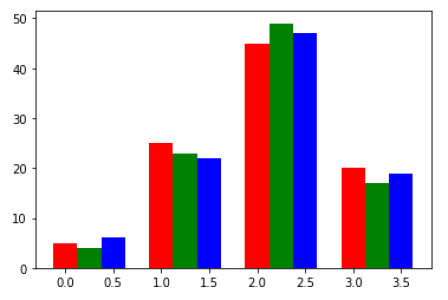
3.The data of three runners over 4 marathons is as given below. Write the code which will create the bar chart as below.

Runners = [[5,25,45,20],[4,23,49,17], [6,22,47,19]]
Ans.
import numpy as np
import matplotlib.pyplot as plt
Run = [[5,25,45,20],[4,23,49,17], [6,22,47,19]]
X=np.arange(4)
plt.bar(X+0.00,Run[0],color='r',width=0.25)
plt.bar(X+0.25,Run[1],color='g',width=0.25)
plt.bar(X+0.5,Run[2],color='b',width=0.25)
plt.show()
4.Given data point p as [2,4,6], the bar chart displayed below has bars for p, p**2 and p**2. Write the code to create the graph.

Ans.
import numpy as np
import matplotlib.pyplot as plt
p= np.array([2,4,6])
x=np.arange(3)
plt.bar(x,p,color='r',width=0.3)
plt.bar(x+0.3,p*2,color='b',width=0.3)
plt.bar(x+0.6,p**2,color='g',width=0.3)
plt.title("Series Comparision")
plt.show()
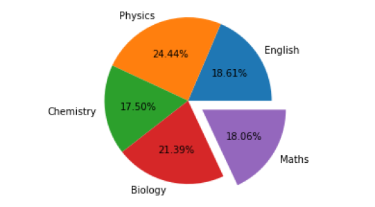
5.Write the code to create a pie chart for marks of a student as below.
| Subject | Marks |
|---|---|
| English | 67 |
| Physics | 88 |
| Chemistry | 63 |
| Biology | 77 |
| Maths | 65 |
- Show Maths value exploded
- Show % contribution for each subject
- The pie chart should be circular
Ans.
import matplotlib.pyplot as plt
Marks=[67,88,63, 77, 65]
Subject=["English","Physics","Chemistry","Biology","Maths"]
plt.axis("equal")
plt.pie(Marks,labels=Subject,explode=[0,0,0,0,0.2],autopct="%1.2f%%")
plt.show()

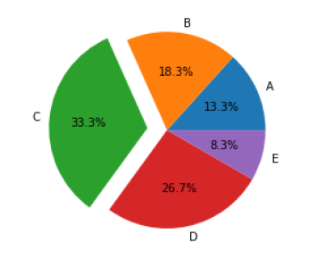
6.Below is given a table consisting of grades and number of students who scored the respective grades in a class. Plot a pie chart to show the data
- The chart should have labels and percentage upto one decimal
- Explode the pie which has the maximum grade.
| Grade | A | B | C | D | E |
|---|---|---|---|---|---|
| No . of students | 40 | 55 | 100 | 80 | 25 |
Ans.
import matplotlib.pyplot as plt
students=[40,55,100,80,25]
grade=['A','B','C','D','E']
exp=[0,0,0.2,0,0]
plt.pie(students,labels=grade,explode=exp,autopct='%2.1f%%')
plt.show()

You may also like

Python Libraries
3 July, 2021

Solve any character pattern program in python
3 June, 2021

Solve any number patterns programs in python
3 June, 2021
